- Ying Wang, PhD
- Stefan Rayer, PhD
Migration has been the dominant source of Florida’s population growth for many years. This article compares domestic in-migration patterns for Florida over three different periods of time: 2005–2007, 2008–2010, and 2011–2013. These three periods are interesting to analyze since they cover years of high population growth prior to the Great Recession, low growth years during the Great Recession, and recovering population growth in the Great Recession’s aftermath. The data came from the American Community Survey (ACS) Public Use Microdata Sample (PUMS) files, released by the U.S. Census Bureau. We aggregated the PUMS data to the county, regional, and state level. This article will highlight three types of migration flows: the largest inflow to Florida counties from other states, the three largest inflows to Florida regions from other states, and the fifteen largest inflows to Florida from other states.
State-to-County In-migration
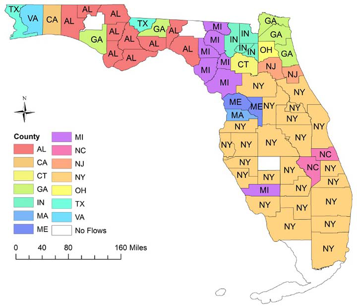
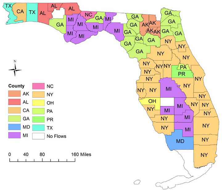
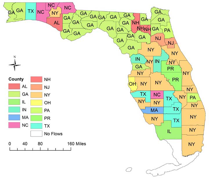
Figure 1 displays the largest inflow to Florida counties from other states over the three time periods. The origin state of the largest inflow for each county is marked with the state abbreviation and a specific color. In 2005 to 2007, a period of high population growth, New York was the primary sending state (Figure 1a). Twenty-four of the 67 Florida counties had their largest inflow from New York; most of these counties were located in central and south Florida. New York was also the primary sending state during the recession period from 2008 and 2010 (23 counties; see Figure 1 b), but during the recovery period from 2011 to 2013 Georgia become the primary sending state (24 counties; see Figure 1 c).
The maps also show the importance of geographic proximity. Counties that received the most migrants from Alabama and Georgia were concentrated in the Florida Panhandle and in other parts of north Florida. The numbers of counties receiving the largest number of migrants from Alabama sharply decreased over the study period (from 10 in 2005–2007 to only 1 in 2011–2013). In contrast, the number of counties with the largest inflow from Georgia went up sharply, from 5 in 2005–2007 to 24 in 2011–2013.
Figure 1. The largest inflow to Florida counties from other states in the United States
1a. 2005 – 2007
1b. 2008 – 2010
1c. 2011 – 2013
State-to-Region In-migration
The aforementioned state-to-county migration flows represent a remarkable geographic concentration of destination regions. To show this, we aggregated Florida counties into four regions (see Figure 2).
Figure 2. Four Regions in Florida
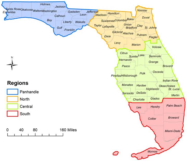
Table 1 summarizes the three largest inflows to the four Florida regions from other states over the three time periods. In the Florida Panhandle and in north Florida, the largest flows occurred between areas with contiguous borders, such as flows from Alabama to the Florida Panhandle and flows from Georgia to the Panhandle and to other areas in north Florida. In contrast, flows to central and south Florida were dominated by states from the Northeast and Midwest, especially New York, Michigan, and New Jersey. Although the number of migrants fluctuated over the three periods, these overall patterns remained quite similar.
Table 1. The three largest inflows to Florida regions from other states in the United States
| Periods of time | Rank | Panhandle | North | Central | South | |||||||||||
| State | Count | State | Count | State | Count | State | Count | |||||||||
| 2005–2007 | 1 | AL | 10,135 | GA | 10,665 | NY | 47,232 | NY | 31,636 | |||||||
| 2 | GA | 9,621 | NY | 9,131 | MI | 18,223 | NJ | 10,890 | ||||||||
| 3 | TX | 8,210 | OH | 5,452 | MA | 16,749 | OH | 9,123 | ||||||||
| 2008–2010 | 1 | GA | 9,533 | GA | 16,225 | NY | 32,651 | NY | 21,315 | |||||||
| 2 | AL | 8,331 | VA | 5,780 | MI | 15,764 | NJ | 9,258 | ||||||||
| 3 | TX | 7,284 | NC | 5,143 | GA | 15,191 | GA | 8,587 | ||||||||
| 2011–2013 | 1 | GA | 8,009 | GA | 12,425 | NY | 29,061 | NY | 24,486 | |||||||
| 2 | AL | 6,366 | VA | 5,792 | PR | 15,816 | NJ | 12,133 | ||||||||
| 3 | NC | 4,354 | NY | 4,863 | PA | 13,645 | GA | 10,327 | ||||||||
State-to-State In-migration
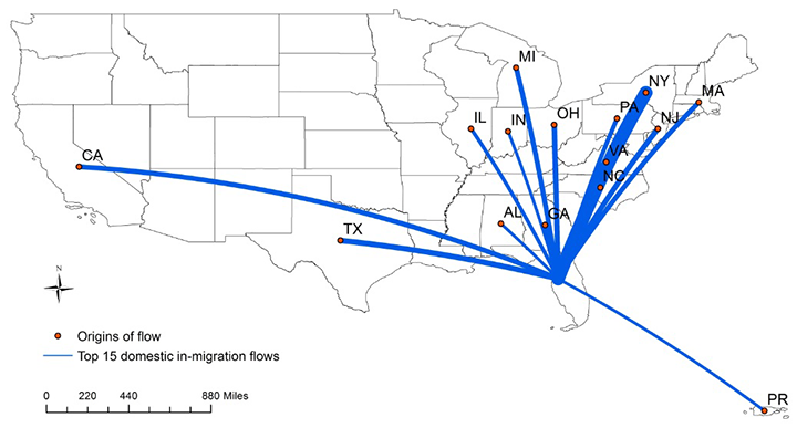
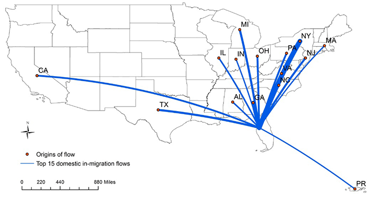
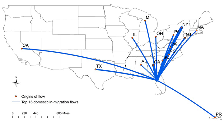
The PUMS files can be also used to compare state to state migration flows over time. Table 2 highlights the 15 largest inflows to Florida from other states over three periods of time.
Table 2. The fifteen largest inflows to Florida from other states in the United States
| Rank | 2005–2007 | 2008–2010 | 2011–2013 | ||||||||
| State | Count | State | Count | State | Count | ||||||
| 1 | New York | 90,837 | New York | 61,146 | New York | 60,237 | |||||
| 2 | Georgia | 41,893 | Georgia | 49,536 | Georgia | 44,219 | |||||
| 3 | Texas | 33,248 | Michigan | 27,405 | New Jersey | 27,313 | |||||
| 4 | Ohio | 32,136 | Texas | 26,953 | North Carolina | 27,023 | |||||
| 5 | New Jersey | 31,822 | Virginia | 26,924 | Pennsylvania | 26,302 | |||||
| 6 | Michigan | 30,244 | New Jersey | 25,262 | Texas | 26,246 | |||||
| 7 | California | 30,101 | North Carolina | 25,075 | California | 23,829 | |||||
| 8 | Massachusetts | 28,593 | Ohio | 23,660 | Ohio | 22,484 | |||||
| 9 | North Carolina | 27,101 | Pennsylvania | 23,488 | Michigan | 21,629 | |||||
| 10 | Pennsylvania | 26,887 | California | 21,988 | Illinois | 21,614 | |||||
| 11 | Virginia | 24,542 | Illinois | 19,094 | Puerto Rico | 21,581 | |||||
| 12 | Illinois | 22,168 | Alabama | 18,057 | Virginia | 21,563 | |||||
| 13 | Puerto Rico | 18,337 | Indiana | 15,860 | Massachusetts | 17,677 | |||||
| 14 | Indiana | 18,256 | Massachusetts | 15,836 | Alabama | 14,998 | |||||
| 15 | Alabama | 17,815 | Puerto Rico | 15,083 | South Carolina | 13,288 | |||||
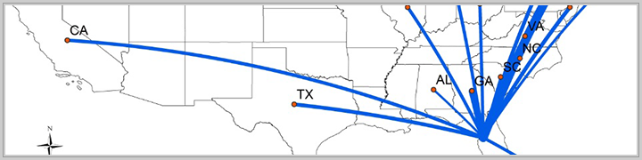
The states sending the largest number of in-migrants to Florida remained largely the same, but the number of migrants and the ranking of the states varied across the three time periods. For example, from 2005–2007 to 2008–2010 the number of migrants from New York to Florida dropped by almost a third from 90,837 to 61,146, while in-migration from Massachusetts declined by almost half (from 28,593 to 15,836). For some states, in-migration picked up again in the post-recession period 2011–2013, but generally not to the levels seen in 2005–2007. Figure 3 shows these patterns graphically; the lines represent the inflows from other states to Florida and the width of the line shows the mover count.
Figure 3. The fifteen largest in flows to Florida from other states in the United States
3a. 2005 – 2007
3b. 2008 – 2010
3c. 2011 – 2013
Although migration inflows from other states represent only one aspect of Florida’s overall population change—migration to other states, foreign migration, and population changes due to births and deaths are not discussed here—the migration flows highlighted in this article are indicative of the patterns of population growth prior to, during, and following the Great Recession. They further document that although there were some shifts in the origins of domestic in-migrants over the three time periods, the dominant sending states—New York and Georgia—remained the same.
POSTED: June 10, 2015